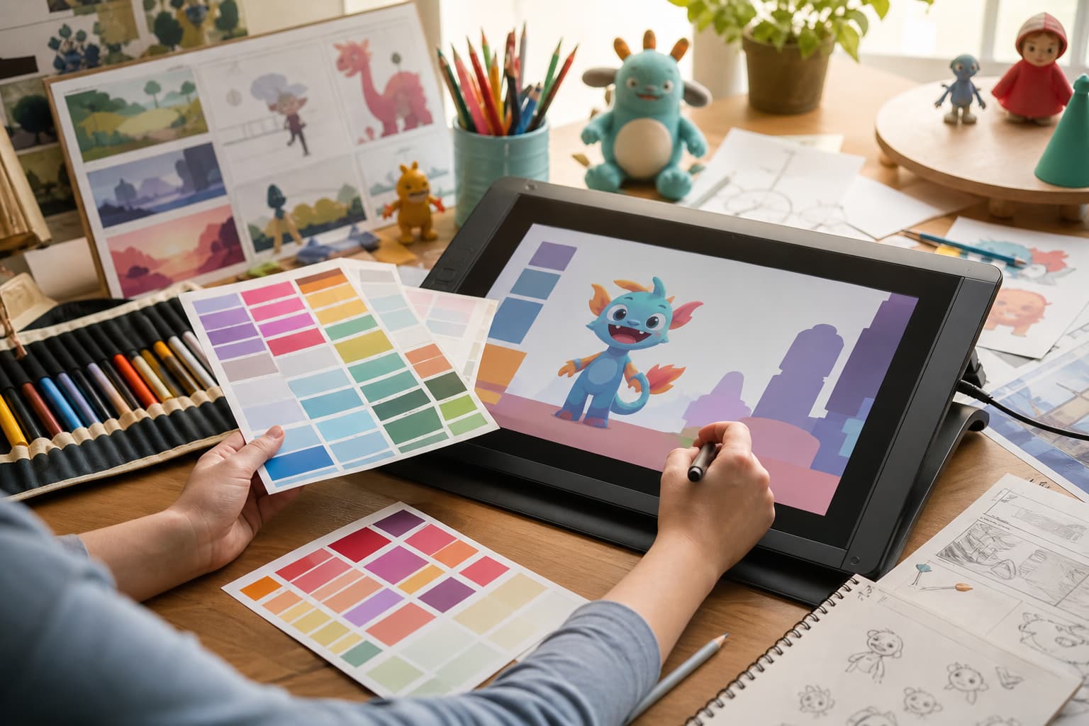
Color is one of the fastest storytelling tools in kids’ animation. Long before a young viewer can explain a plot twist or name a character trait, they can recognize a bright jacket, a soft blue bedroom, or a glowing red warning light. That visual memory helps animated stories feel friendly, readable, and emotionally clear.
For studios, educators, and family entertainment teams, color is not just decoration. It is part of character design, pacing, accessibility, merchandising, and the way a show or short film moves from screen to book, toy, poster, or classroom activity. A thoughtful palette can make a small production feel more polished and help children follow the story without extra explanation.
Why Color Works So Well for Young Viewers
Children often process visual signals before they process dialogue. A consistent color cue can tell them who is brave, who is nervous, where safety is, or when the mood has changed. This is especially important in animation for preschool and elementary audiences, where stories need to be lively but not confusing.
Strong color choices also reduce cognitive load. If every main character has a distinct palette, children can identify them from a distance, in fast motion, or even in simplified merchandise. If every emotional beat has the same visual intensity, however, the story becomes tiring. The best palettes create rhythm: a bright moment, a quieter scene, a surprise, then a soft landing.
From Character Palette to Story Cue
Character recognition
A memorable animated character usually has a small set of repeatable color decisions. One dominant color, one supporting color, and one accent are often enough. The goal is not to make the character loud; the goal is to make the character recognizable in different poses, lighting conditions, and media formats.
Scene mood
Backgrounds carry emotional weight too. A soft green park can suggest exploration without danger. A dusky purple street can make a mystery feel exciting rather than frightening. Warm kitchen colors can make a family scene feel safe. When colors are planned at the story level, the audience feels the shift even when the script stays simple.
| Color choice | Animation use | Why it helps children |
| Warm accent | A scarf, backpack, or glowing prop | Draws attention to the active story object |
| Cool background | Bedroom, classroom, night sky, or calm forest | Keeps the scene gentle and readable |
| High contrast pair | Hero and sidekick silhouettes | Makes characters easier to separate in motion |
| Muted bridge color | Transitions between action scenes | Gives the eye a rest before the next big beat |
A Practical Color Workflow for Small Animation Teams
Small studios and independent animators often juggle concept art, storyboards, social posts, pitch decks, printed flyers, and licensing mockups at the same time. A simple shared color system prevents those assets from slowly drifting away from the original character design.
When a team moves from Pantone references to HEX values for screen assets and CMYK print materials, a Color Finder such as Hue.ink can help designers compare colors and keep the creative handoff clearer across animation, promotional graphics, and printed materials.
A useful workflow does not need to be complex. It needs to be repeatable:
- Start with an emotional map before choosing final colors: comfort, energy, curiosity, surprise, relief.
- Lock the main character colors early, then test them against several backgrounds.
- Preview scenes on a phone, a tablet, a television, and a projector if the work may be shown at events.
- Check whether important story objects still stand out for children with different visual needs.
- Keep a short palette note for every recurring setting so future artists can match it quickly.
Color Mistakes That Make Kids’ Stories Harder to Follow
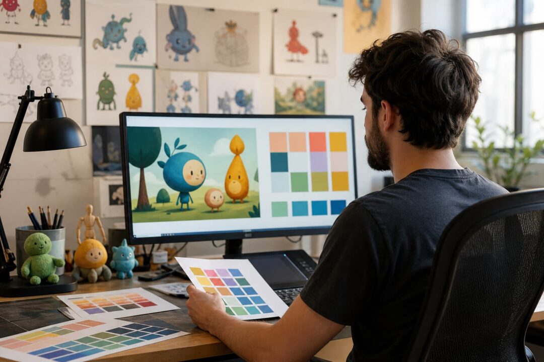
The most common problem is not bad taste; it is overuse. If every prop is saturated, nothing feels important. If every character wears a full rainbow, children may remember the noise but not the role. If a danger cue and a celebration cue use the same red, the story can send mixed signals.
Another issue appears when screen colors are chosen without thinking about print. A poster, activity sheet, or book cover may look dull if the color plan only worked on a bright monitor. Family entertainment brands often live in many places at once, so consistency matters beyond the animation file.
Bringing Consistency Beyond the Screen
Kids’ entertainment rarely stays inside one format. A character may begin in a short video, then appear in a birthday invitation, educational worksheet, sticker pack, mobile game, or convention banner. When the palette stays consistent, the brand feels more trustworthy to parents and more familiar to children.
That consistency also helps collaborators. A color script gives animators a shared emotional direction. A palette guide helps illustrators and designers avoid guesswork. A print reference helps event teams and merch partners reproduce the world accurately. The result is not a stricter creative process; it is a smoother one.
Final Thought
Great color design in kids’ animation is both imaginative and practical. It gives children visual anchors, helps parents recognize quality, and allows a creative idea to travel from screen to real-world experiences without losing its personality. When color choices are treated as part of the story, every frame becomes easier to understand and more fun to remember.